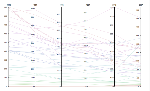
This image compares the total number of apple orchards by state from the year 1982-2007. From this chart we can see that in that amount of time, the total number of orchards has been reduced drastically. This is due to larger mass production operations dominating the market and putting smaller growers (who are generally the ones growing different varieties of apples out of business.
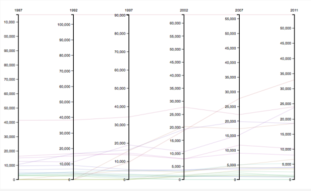
This chart shows the amount of individual varieties of apples grown in the US from 1987-2011. The line at the top of the chart is Red Delicious. It consistently surpasses every other apple by a large margin. The next line down is the Golden Delicious, which has stayed fairly consistent. We can also see the dramatic increase in the Gala apple, which has reached second place in 2011, and the less dramatic, but still notable increase in the fuji apple, which has caught up with the Golden Delicious in 2011. These new varieties have sprung up in the past 30 years and become increasingly popular.
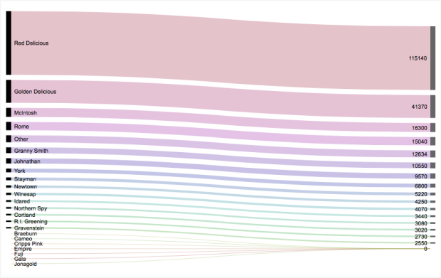
This chart shows the data shown in the chart above for the year 1987. It makes it easier to see that the Red Delicious dominated the market by a large margin. These are the types of apples that make up most of the US apple crops. Even between the top few varieties at the top of the chart and the varieties at the bottom, it is easy to see a disparity.
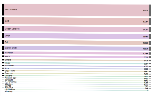
This chart shows the data shown above for the year 2011. Although the Red Delicious no longer has such a lead on the other varieties, it is still in first place. Further, there are still only a few apples dominating the market. One positive increase is the “other” apple category, which has increased quite a bit since 1987. However, ideally, we want to see the other take the top slot, which would indicate more biodiversity.
